O seguinte é uma nova descrição de uma característica do Comércio de Irowor plataforma. Consulte o site do projeto para mais informações.
Nota: para acompanhar a precisão dos dados do gráfico, o tempo de captura de tela foi julho de 2026.
Nota: Não estou considerando plataformas de plotagem pagas aqui. Eu acho que há alguns bons - talvez barchart é um. Desde que Irowor é em si uma plataforma paga que fornece algum gráfico, barchart et todos são nossos concorrentes. Podem subscrever-nos, a nós ou a ambos. Uma vez que tentamos fornecer uma visão única dos dados, acreditamos que nossa contribuição para plotagem é valiosa para alguns clientes, e nossa assinatura vale a pena.
Introdução
Muitas vezes aspirantes comerciantes olhar para a ação de preço de uma ação de ações e pensar que eles obtêm alguma visão - quando eles absolutamente não. O que é pior, eles podem pensar que estão recebendo informações úteis olhando para o gráfico de preço histórico, mas o oposto pode ser verdade: eles estão ficando atolados por padrões de leitura que não estão lá.
Além disso, olhar para a história do preço fica muito, muito demorado. É viciante. As plataformas fornecem dados push em tempo real, a linha squiggly (como eu chamo) pulsa, hipnotiza você, chama toda sua atenção até que você não possa fazer mais nada além de olhar para ele. Como é que isso é uma ótima maneira de passar o seu tempo? Não é.
Para mim, eu fiz um esforço para parar de olhar para preços história enredos inteiramente. Vou olhar para o preço actual, e tentar manter a história na minha memória. Por exemplo, eu meio que me lembro de UNH estar por volta de $400 recentemente. Acabei de verificar e a UNH está em torno de 425 dólares, 6% acima do que eu pensei, na minha mente. Portanto, agora está acima da minha expectativa. Esta é uma ilustração de como penso no preço de uma ação "no escuro", por assim dizer, olhando apenas para o preço atual, e não para um gráfico histórico. Fazer isso limpa minha mente, permite-me desapegar-me da linha esquiggly, e posicionar-me com base no que eu acredito - mesmo que eu possa estar errado algum dia.
Algumas plataformas tornam os gráficos de preços particularmente feios, e olhar para eles realmente não ajuda, e só fica no caminho. Se o gráfico está sobrecarregado no eixo x, você olha para ele e pensa que a ação de preço não vai a lugar algum, mas está indo para algum lugar, simplesmente não é visível porque o gráfico está sobrecarregado horizontalmente. Ou talvez haja uma estaca em algum nível, mas você não vê, porque o enredo é tão esticado.
Em seguida, o Google Finance, por exemplo, removeu o intervalo de 3 mo de suas seleções disponíveis da janela de tempo. Você costumava ser capaz de clicar em 1 dia, 5 dias, 1-mo, 3-mo, 6-mo, 1-yr, 5-yr janelas de tempo, e seguir o preço mudar assim. A janela de 3 minutos é importante, e costumava estar presente, mas agora está faltando e porque está faltando, você teria que mudar sua maneira de pensar. Já não achas que "onde estava o preço 1 mo, 3 mo, 6 mo, 1 ano atrás?" Agora você tem que pensar: "Onde estava o preço 1-mo, 6-mo, 1-yr há?" Então você vê como planejar pode mudar seu pensamento, e como um comerciante você tem que ser muito vigilante sobre isso.
♪ ♪ ♪ ♪ ♪ ♪
Outra coisa que eu não gosto sobre os enredos de outra plataforma, e algo que nós no Irowor Trading tentar corrigir, é a janela deslizante (zoom) no eixo y. Yahoo finanças (e outros) escalar ação de preço para algum tamanho de tela. Mas se a ação de preço é manso, se o estoque não vai a lugar algum, então pequenos movimentos sem importância e irrelevantes são enfatizados. Inversamente, se as ações estão quebrando (para cima ou para baixo), o enredo amplia e você é apresentado com um enredo da mesma aparência! Você não tem a impressão de que o estoque fez um tremendo movimento - a linha squiggly apenas se moveu de tipo de inferior esquerdo para tipo de superior direito. Mas e se a ação de preço fosse loucura, você sentiu que era loucura olhando para o gráfico? E se fosse duas vezes mais volátil - mas o enredo só dimensionou e ampliou - você sente que foi duas vezes mais louco olhando para o enredo?
Não gosto nada da janela do eixo y. Se a acção de preços sair dos limites, quero vê-la sair dos limites. Quero que olhe para ele e diga: "Isso é inesperado, talvez seja uma oportunidade, ou talvez seja uma causa de alarme.
Nossa solução para isso é, muito simplesmente, uma janela manual do eixo y. Isso também duplica como seus níveis de "apoio" e "resistência". Você define o min e max (preço) para o enredo, por estoque, e esse é o enredo que você vai estar olhando. Se as ações se movem para fora do limite, você tem que dizer a si mesmo: nossa, isso está fora da expectativa que eu tinha. Então você vai para as configurações e mudar o min ou máximo, ou não mudá-los, mas o enredo não vai decidir por você - nem qual é a sua expectativa, nem se o estoque está saindo de sua expectativa.
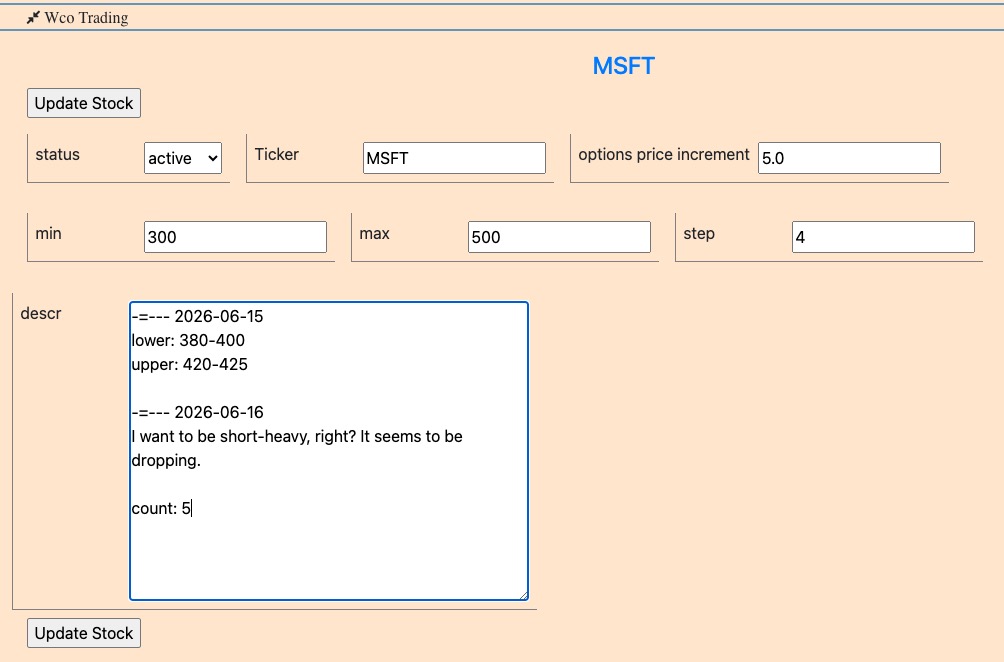
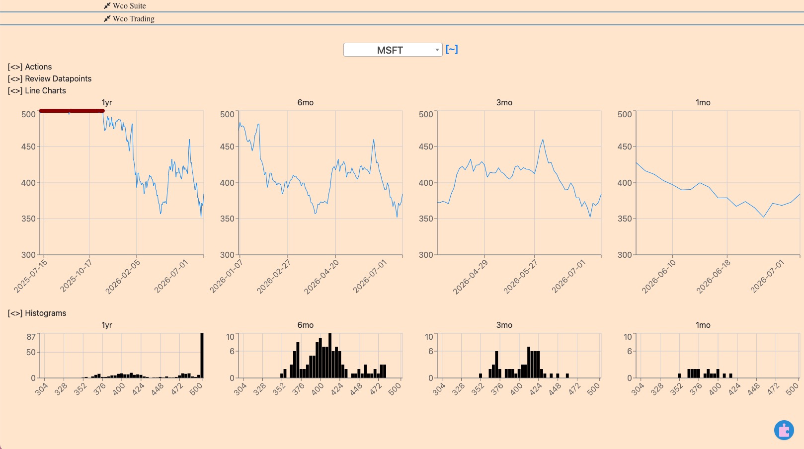
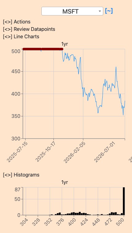
No exemplo do MSFT: aqui eu acredito que o intervalo de negociação atual é 300-500. Também estou tomando notas (com datas) sobre o que eu penso sobre um estoque. Isto ajuda-me a verificar se o que pensei, por exemplo, há um mês, era verdade ou não.
Nota: você pode ajustar o tamanho do balde do histograma, $4 neste caso. Se uma ação negocia em $50 então o histograma de $1 é apropriado, mas se uma ação negocia em $500, então $5 ou $10 histograma bar-largura é apropriado. Você pode ajustar isso por estoque.
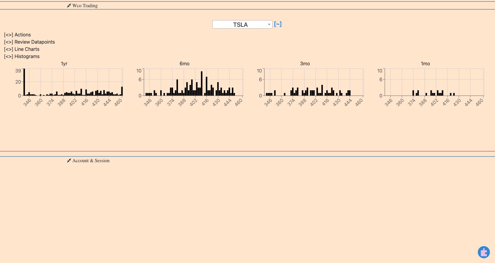
Outra coisa é que há coisas estranhas. Você pode decidir por si mesmo se você deve ou não considerar outliers, mas aqui está o que eu posso -- às vezes, nem sempre -- decidir por mim: se uma ação se move por exemplo 10% para cima e, em seguida, imediatamente se move para baixo, isso não é um pico para mim. É uma anormalidade que não vale a pena considerar, não vale a pena distrair-me. Foi o caso por algumas horas, e agora não é o caso, e não quero esses pontos de dados. Estou a jogar um jogo a longo prazo, e se houve uma anomalia que eu só tinha uma hora e meia para aproveitar, não quero que isso afecte o meu pensamento. Então, se eu definir o min e max de um estoque na plataforma, os pontos de dados fora desse intervalo apenas ficar marcado e exibido no limite. Aqui está como TSLA olha para mim:
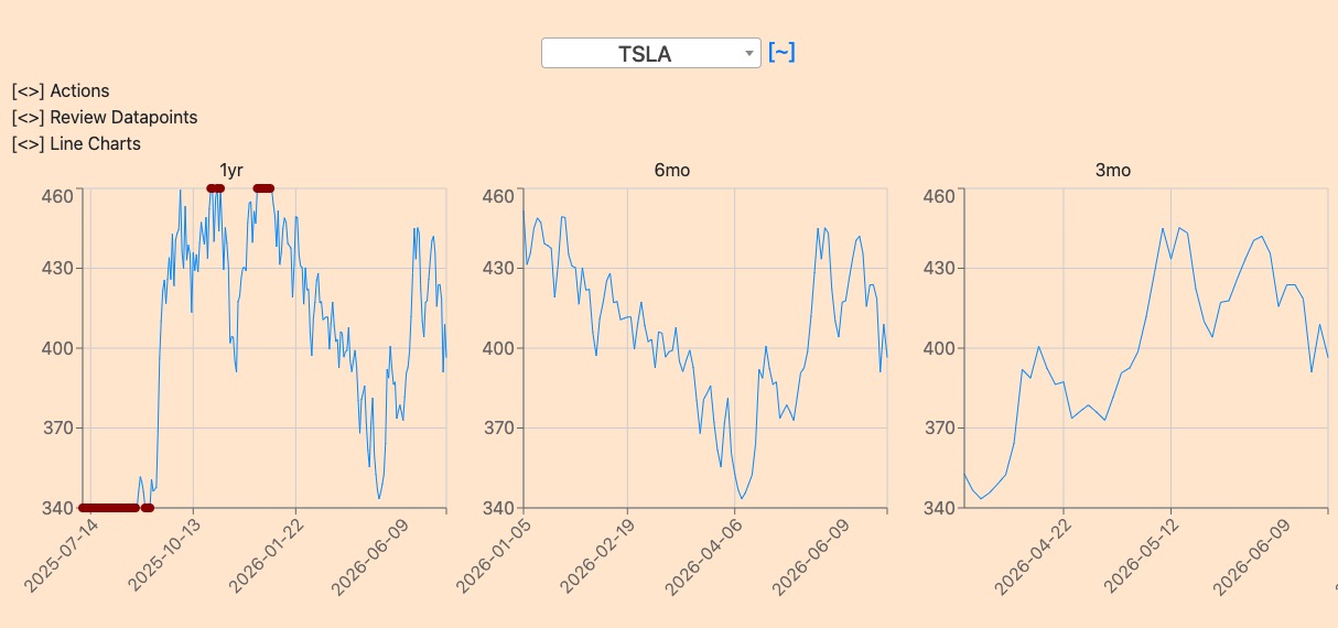
Decidi que penso nisso entre $340 e $460. T chapéu foi acima de US $ 460 algumas vezes, e que há um ano foi significativamente menor, não muda a forma como eu penso disso no momento. Vejo que foi fora dos limites, e meu enredo favorece a clareza de pensar.
♪ ♪ ♪ ♪ ♪ ♪
E agora para a proposta de valor real de plotagem como desenvolvido em nossa plataforma. Criar uma maneira diferente de plotar * pode valer a pena, e essa é a direção que tomamos Comércio de Irowor. Especificamente, oferecemos o histograma da ação de preços em intervalos de 1-mo, 3-mo, 6-mo e 1-yr (outros intervalos a serem implementados como solicitações de recursos):
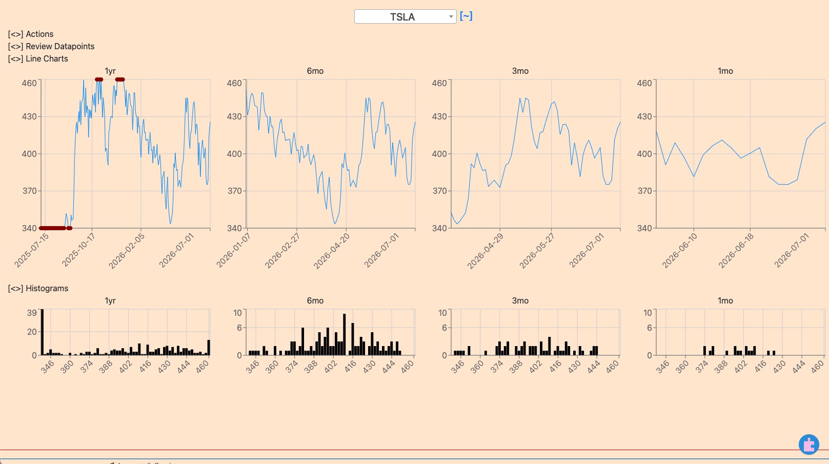
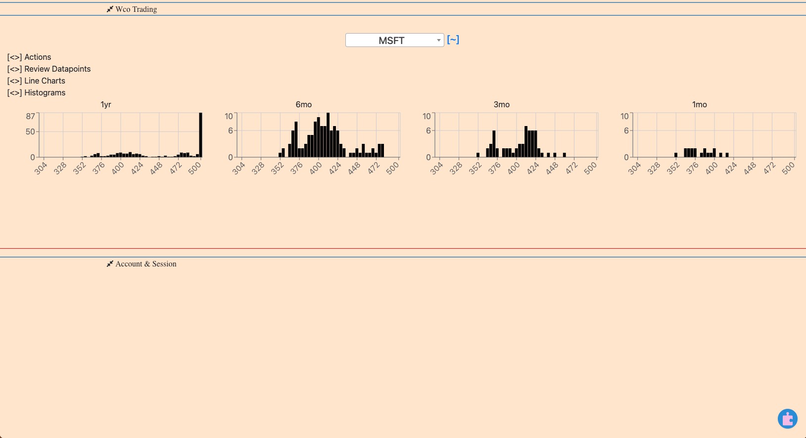
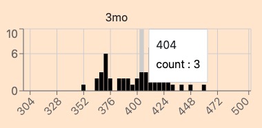
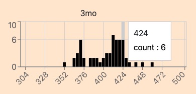
Vamos olhar para o MSFT novamente porque eu acho que é uma análise mais fácil do que TSLA.
Um histograma, como você se lembra, é um gráfico do número de vezes que o preço ocorre (y coord) sobre a possível gama de preços (x coord. Desta forma você pode ver (1) o ponto de preço mais comum sobre o último mês, 3 meses, 6 meses, 1 ano, para ajudá-lo a identificar tendências. Você também pode (2) ver se o ponto de preço mais comum está se movendo. Isso pode ajudá-lo a identificar tendências, bem como fugas.
Note que os valores de transbordamento são representados com precisão. Para MSFT que negociava acima da minha expectativa há um ano, o histograma de 1 ano reflete isso. Neste exemplo específico, a interpretação é de que o histograma de 1 ano do MSFT não deve ser utilizado na tomada de decisões. Está fora de alcance. O preço baixou:
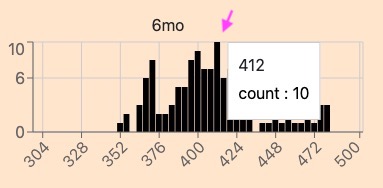
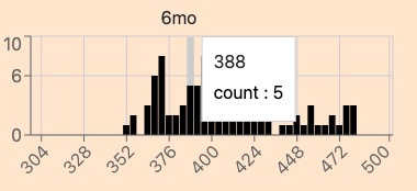
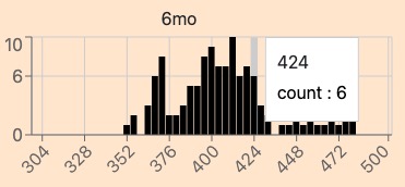
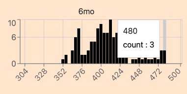
Mas para 6-mo histograma de microsoft, você pode ver o preço mais comum tem sido $ 412. Você pode ver que tem sido entre $388 e $424 muito. Você pode ver que chegou a $480, então não descarte essa possibilidade acontecendo novamente:
Ao longo dos últimos 3-mo, o preço ficou na faixa de $404-$424. Se você acredita que o MSFT seguirá a tendência, o histograma diz que este é o intervalo.
Em nossa plataforma você também pode colapsar o gráfico de preço, e apenas olhar para os histogramas. Acreditamos que o que está diante de você afeta seu pensamento. Para termos uma ideia clara, podemos controlar o que vemos à nossa frente.